The Subway Times
Designed to help NYC commuters navigate the subway system in real time.
Problem Over the years I have heard both NYC residents and tourists complain about their frustrations with riding the Subway. As much as we love the connectivity factor, there’s no denying that the service has a reputation for being inconsistent. With the amount of delays and disruptions the subway experiences one would assume the information is easily communicated. May it be unclear overhead announcements, lack of signage or unhelpful apps the poor communication has left subway riders feeling defeated.
GoalsThe Research
Role UX/UI Designer of this project from end to end
ProcessResearch, Interviews, Surveys, Competitive analysis, Ideation, Prototyping, Testing, Evaluation
Research began with carefully conducted screener surveys on social media from where I chose five users that I would then interview. Two out of the five interviewees were NYC tourists and the other three were residents. All five users had used the subway for commuting and had negative experiences navigating it. The results proved that no matter how much time someone had spent in NYC that the Subway consistently caused frustration, confusion and anger. Any announcements that were given to these users in their commuting experience were unclear and hard to decipher. Furthermore, no solution for delays or disruptions were given to users which ultimately led to increased agitation. All five user interviews solidified the idea that the subway system required a clearer mode of communication.
Reduce frustrations - Help all subway users move around NYC efficiently and effectively.
Provide real time help - Users should receive real time alerts based on their location while commuting.
“I hate when I’m on the Subway and the train randomly switches lines. Now I’m off course and have no idea how to get to my destination!”
User Stories
After completing the user interviews I had many different ideas on how to deal with the issue. I narrowed them down to help identify what stories best aligned with my users goals and needs.
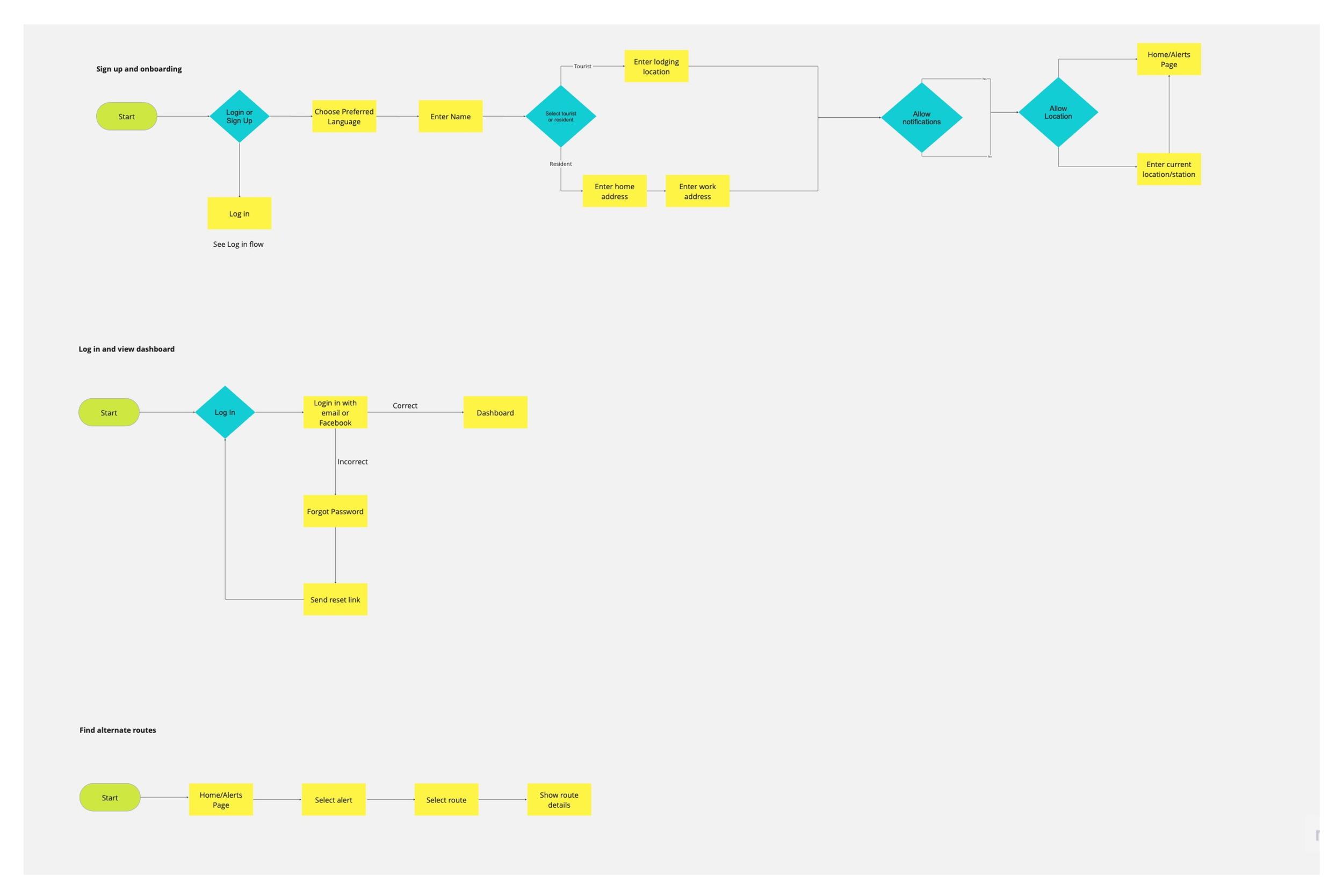
User Flows
These high level structures represent critical user flows of the application along with breaking down the routes users would take to complete tasks.
The Design Process
Ideate
Before jumping into the digital design I sketched out the most critical routes that my users would deem most helpful. Moving onto the wireframes made the navigation and flow of the screens straightforward. Each main user flow is represented through a sketch and then eventually through a wire flow.
Moodboard
The moodboard for The Subway Times is meant to represent a state of ease and simplicity. The color palette is inspired off of the Subway metro card . With a light and minimalist feel the app should deliver only the necesssary information to the user.
Brand Attributes:Simple
Calm
Minimalistic
Organic
Breathable
Trustworthy
Usability Testing
Issues:
The flow of the screens were confusing, users were unsure how to navigate the app
After onboarding the ‘Done!’ screen was confused for the end of the flow
All my screens had the same ‘View’ button. I think having one name/description for all levels of buttons made it the call to action unclear
Changes made:
Added a tab for ‘Favorite Routes’ since all users voiced the interest to favorite they're most commonly used routes. Additionally, this improved the flow of screens
Changed the names of the ‘View’ button to specify what the action was for.
Lastly, I added sub pages so that the architectural hierarchy of the screens would be clearer. Now the ‘All Routes’ tab and the ‘Favorites Route’ tab both had a second screen living in them.
Solution Overview
I designed a real time approach to dealing with constant subway delays and disruptions. With the help of The Subway Times all commuters will be warned of any service disruptions and provided a solution. The Subway Times now acts as a supplementary app to your standard navigation app allowing all users to receive detailed real time updates on their travel and the next best way to get to their destination.
Main Features
Alternative Routes
Users can receive alerts about subway service and in addition choose the best alternative way to get to their destination.
Filter Alert Type
Users can filter through alert types depending on what type of subway announcement they are looking for.
Real Time Notifications
Users can allow their location and notifications so that the app can give them real time alerts depending on their whereabouts.
Thoughts and reflections
If I were to re-do this project I would have made the following changes:
Added a drop down menu to choose specific subway lines, this way users can select their favorite lines and stay posted on any alerts in correspondence to that particular train line.
Get rid of the bottom tab, the icons are not needed. Only necessity is the profile icon which I would position on the top corner.
Add a few illustrations or drawings to the app to make it slighlty more inviting


